EDA(Exploratory Data Analysis)
This is the First step in data science. It is an approach to analyzing datasets. there are lots of techniques to explore datasets and visual methods. The main purpose of EDA is to help look at data before making any assumptions. It can help identify obvious errors, as well as better understand patterns within the data.
In this blog, I’m Using Haberman’s Cancer Survival Dataset and perform various EDA techniques using python.
If You Want to Download Dataset, here it is:
EDA On Haberman’s Cancer Survival Dataset
Introduction
Title: Haberman’s Survival Data
Description: Haberman’s dataset contains data from the study conducted at the University of Chicago’s Billings Hospital between the years 1958 to 1970 for the patients who underwent surgery for breast cancer.
There are four attributes:
- Age of patient
- Operation year
- Number of Axillary Nodes
- Survival Status
Let’s start the analysis part.
Importing libraries and loading the file
import pandas as pd
import numpy as np
import matplotlib.pyplot as plt
import seaborn as snshab = pd.read_csv("Haberman.csv")
Data Observation & Visualization
hab.head()Output:

.head() method prints the 5 entries from CSV data. as we can see column names in number format so we can replace them, on Kaggle Haberman’s Dataset Details there,1st column value 30 is Age, 2nd column value 64 is Operation year, 3rd column value 1 is Axillary Nodes & 4th Column value 1.1 is Survival Status.
hab.columns=[‘Age’,’Op_year’,’axil_nodes’,’Surv_status’]
hab.columns
So I have replaced them with
30 = ‘Age’ , 64 = ‘Op_year’ , 1 = ‘axil_nodes’ , 1.1 = ‘Surv_status’

hab.shapeOutput: (305, 4)
hab.info()Output:
<class 'pandas.core.frame.DataFrame'>
RangeIndex: 305 entries, 0 to 304
Data columns (total 4 columns):
 #   Column       Non-Null Count  Dtype
---  ------       --------------  -----
 0   Age          305 non-null    int64
 1   Op_year      305 non-null    int64
 2   axil_nodes   305 non-null    int64
 3   Surv_status  305 non-null    int64
dtypes: int64(4)
.info() method shows, Haberman's dataset has all columns data type is an integer.
hab[‘Surv_status’].value_counts()Output:
1    224
2     81
Name: Surv_status, dtype: int64
.value_counts() method use to series containing counts of unique values.we use .value_counts() on ‘Surv_status’ column there is two unique numbers ‘1’ and ‘2’.
1: patient survived 5 years or longer
2: patient died within 5 years
From the above code output as we can see there is 224 patient who survived 5 years or longer and 81 patient died within 5 years.
hab.isnull().sum()Output:
Age            0
Op_year        0
axil_nodes     0
Surv_status    0
dtype: int64
.isnull() method to check if there is any null data available in the dataset.
Univariate Analysis
Univariate analysis is the simplest form of analyzing data. “Uni” means “one”, so in other words, your data has only one variable. It takes data, summarizes that data, and finds patterns in the data.
Let's plot a 1-D Scatter plot. First We distinguish data from ‘Surv_status’.
sns.set_style(‘whitegrid’)
hab_long_surv = hab.loc[hab[‘Surv_status’] == 1]
hab_short_surv = hab.loc[hab[‘Surv_status’] == 2]
plt.plot(hab_long_surv[‘axil_nodes’],np.zeros_like(hab_long_surv[‘axil_nodes’]),’o’)
plt.plot(hab_short_surv[‘axil_nodes’],np.zeros_like(hab_short_surv[‘axil_nodes’]),’o’)plt.show()

Observation:
Here We can see hab_short_surv data is overlapping hab_long_surv basis on axillary nodes. so we can’t decide the basis on a 1-D Scatter plot. for better clarification, we will use PDF & CDF.
Probability Density Function(PDF)
Probability Density Function is a smooth version of a histogram.
sns.FacetGrid(hab,hue=’Surv_status’,size=5).map(sns.distplot,’Age’).add_legend()
Observation:
So here we can see the age between 30–40 there are more chances of surviving, between 40–60 there are more chances of the patient will not be surviving and 60–80 there is an equal chance of surviving or not surviving. so we cannot decide patient survival chances on basis of Age.
sns.FacetGrid(hab,hue=’Surv_status’,size=5).map(sns.distplot,’Op_year’).add_legend()
Observation:
On basis of operation years, data is overlapping. So we cannot decide on the survival chances of the patient.
Cumulative Distribution Function(CDF)
a function that gives the probability that a random variable is less than or equal to the independent variable of the function. it is used to the representation of cumulative data of PDF.
plt.figure(figsize=(20,5))
for i, x in enumerate(list(hab.columns)[:-1]):

   plt.subplot(1, 3, i+1)
   counts, bin_edges = np.histogram(hab[x], bins=10, density=True)
   print(feature,’:{}’.format(bin_edges))
   pdf = counts/sum(counts)
   print(x,’:{}’.format(pdf))
   cdf = np.cumsum(pdf)
   print(x,’:{}’.format(cdf))
   print(‘===========================’)
   plt.plot(bin_edges[1:], pdf, bin_edges[1:], cdf)
   plt.xlabel(x)
output:
Age :[30.  35.3 40.6 45.9 51.2 56.5 61.8 67.1 72.4 77.7 83. ]
Age :[0.04918033 0.08852459 0.15081967 0.17377049 0.18032787 0.13442623
 0.13442623 0.05901639 0.02295082 0.00655738]
Age :[0.04918033 0.13770492 0.28852459 0.46229508 0.64262295 0.77704918
 0.91147541 0.9704918  0.99344262 1.        ]
===========================
Op_year :[58.  59.1 60.2 61.3 62.4 63.5 64.6 65.7 66.8 67.9 69. ]
Op_year :[0.20655738 0.09180328 0.0852459  0.07540984 0.09836066 0.09836066
 0.09180328 0.09180328 0.08196721 0.07868852]
Op_year :[0.20655738 0.29836066 0.38360656 0.45901639 0.55737705 0.6557377
 0.74754098 0.83934426 0.92131148 1.        ]
===========================
axil_nodes :[ 0.   5.2 10.4 15.6 20.8 26.  31.2 36.4 41.6 46.8 52. ]
axil_nodes :[0.7704918  0.09836066 0.05901639 0.02622951 0.0295082  0.00655738
 0.00327869 0.         0.00327869 0.00327869]
axil_nodes :[0.7704918  0.86885246 0.92786885 0.95409836 0.98360656 0.99016393
 0.99344262 0.99344262 0.99672131 1.        ]
Observation:
Above Plot based on all features, Blue Line is PDF, and Orange Line is CDF. as we can see almost 80% of patients have less than 10 axillary nodes.
plt.figure(figsize=(20,5))
for i, x in enumerate(list(hab.columns)[:-1]):

   plt.subplot(1, 3, i+1)
   counts, bin_edges = np.histogram(hab_long_surv[x], bins=10,     density=True)
   print(x,’:{}’.format(bin_edges))
   pdf = counts/sum(counts)
   print(x,’:{}’.format(pdf))
   cdf = np.cumsum(pdf)
   print(x,’:{}’.format(cdf))
   print(‘===========================’)
   plt.plot(bin_edges[1:], pdf, bin_edges[1:], cdf)
   plt.xlabel(x)

   plt.subplot(1, 3, i+1)
   counts, bin_edges = np.histogram(hab_short_surv[x], bins=10, density=True)
   print(x,’:{}’.format(bin_edges))
   pdf = counts/sum(counts)
   print(x,’:{}’.format(pdf))
   cdf = np.cumsum(pdf)
   print(x,’:{}’.format(cdf))
   print(‘===========================’)
   plt.plot(bin_edges[1:], pdf, bin_edges[1:], cdf)
   plt.xlabel(x)
output:
Age :[30.  34.7 39.4 44.1 48.8 53.5 58.2 62.9 67.6 72.3 77. ]
Age :[0.04910714 0.10714286 0.125      0.09375    0.16517857 0.16517857
 0.09375    0.11160714 0.0625     0.02678571]
Age :[0.04910714 0.15625    0.28125    0.375      0.54017857 0.70535714
 0.79910714 0.91071429 0.97321429 1.        ]
===========================
Age :[34.  38.9 43.8 48.7 53.6 58.5 63.4 68.3 73.2 78.1 83. ]
Age :[0.03703704 0.12345679 0.19753086 0.19753086 0.13580247 0.12345679
 0.09876543 0.04938272 0.02469136 0.01234568]
Age :[0.03703704 0.16049383 0.35802469 0.55555556 0.69135802 0.81481481
 0.91358025 0.96296296 0.98765432 1.        ]
===========================
Op_year :[58.  59.1 60.2 61.3 62.4 63.5 64.6 65.7 66.8 67.9 69. ]
Op_year :[0.1875     0.10714286 0.10267857 0.07142857 0.09821429 0.09821429
 0.06696429 0.09821429 0.09375    0.07589286]
Op_year :[0.1875     0.29464286 0.39732143 0.46875    0.56696429 0.66517857
 0.73214286 0.83035714 0.92410714 1.        ]
===========================
Op_year :[58.  59.1 60.2 61.3 62.4 63.5 64.6 65.7 66.8 67.9 69. ]
Op_year :[0.25925926 0.04938272 0.03703704 0.08641975 0.09876543 0.09876543
 0.16049383 0.07407407 0.04938272 0.08641975]
Op_year :[0.25925926 0.30864198 0.34567901 0.43209877 0.5308642  0.62962963
 0.79012346 0.86419753 0.91358025 1.        ]
===========================
axil_nodes :[ 0.   4.6  9.2 13.8 18.4 23.  27.6 32.2 36.8 41.4 46. ]
axil_nodes :[0.83482143 0.08035714 0.02232143 0.02678571 0.01785714 0.00446429
 0.00892857 0.         0.         0.00446429]
axil_nodes :[0.83482143 0.91517857 0.9375     0.96428571 0.98214286 0.98660714
 0.99553571 0.99553571 0.99553571 1.        ]
===========================
axil_nodes :[ 0.   5.2 10.4 15.6 20.8 26.  31.2 36.4 41.6 46.8 52. ]
axil_nodes :[0.56790123 0.14814815 0.13580247 0.04938272 0.07407407 0.
 0.01234568 0.         0.         0.01234568]
axil_nodes :[0.56790123 0.71604938 0.85185185 0.90123457 0.97530864 0.97530864
 0.98765432 0.98765432 0.98765432 1.
Observation:
we can see based on the ‘axil _node’ feature if there are less than 10 nodes then there is almost an 82% chance of surviving.
Box Plot, Whisker sand Violin Plots
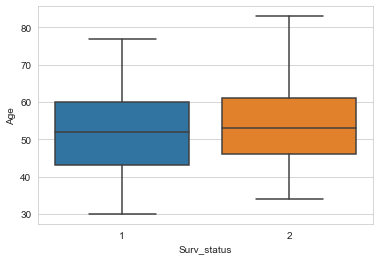
a box plot or boxplot is a method for graphically depicting groups of numerical data through their quartiles. The line that extends from the box is whisker. The outliers points outside the box.
sns.boxplot(x=’Surv_status’,y=’age’,data=hab)
plt.show()sns.boxplot(x=’Surv_status’,y=’Op_year’,data=hab)
plt.show()sns.boxplot(x=’Surv_status’,y=’axil_nodes’,data=hab)
plt.show()


Observation:
As we can see Age and Op_year box plot. data is overlapping in both. for axil_nodes there are some outliers.
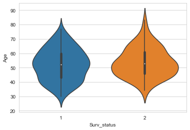
sns.violinplot(x=’Surv_status’,y=’Age’,data=hab)
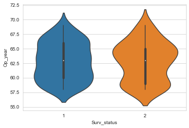
plt.show()sns.violinplot(x=’Surv_status’,y=’Op_year’,data=hab)
plt.show()sns.violinplot(x=’Surv_status’,y=’axil_nodes’,data=hab)
plt.show()


Observation:
As we can see Age and Op_year Overlapping. axil_nodes if nodes less than 5 the spread of long survival is more than short survival. if less than 0 nodes chances of short surviving.
Bivariate Analysis
Bivariate analysis is one of the simplest forms of quantitative analysis. It involves the analysis of two variables, for the purpose of determining the empirical relationship between them.
2-D Scatter plot
sns.set_style(‘whitegrid’)
sns.FacetGrid(hab,hue=’Surv_status’,size=5).map(plt.scatter,’Age’,’Op_year’).add_legend()
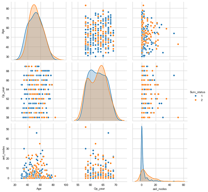
Pair Plot
sns.pairplot(hab,hue=’Surv_status’,size=3)
Observation:
as we can see Op_year and axil_nodes have chances of patient survival is more.
Contour Plot
A contour plot is used for Multivariate Analysis. A contour line of a function of two variables is a curve along which the function has a constant value so that the curve joins points of equal value.
sns.jointplot(x = ‘Age’, y = ‘axil_nodes’, data = hab, kind = ‘kde’)
plt.show()
Observation:
As we can see the density of point for long survival between 48 to 56 and axil_nodes 0 to 3.
Conclusion:
Patients having who have 0 axil nodes are more chances to survive.Axil_nodes is the most important feature in this dataset.
